Oura Redesign
A redesign of the Oura app that helps people understand their sleep, readiness and activity data, and know what to do next.
What Is Oura?
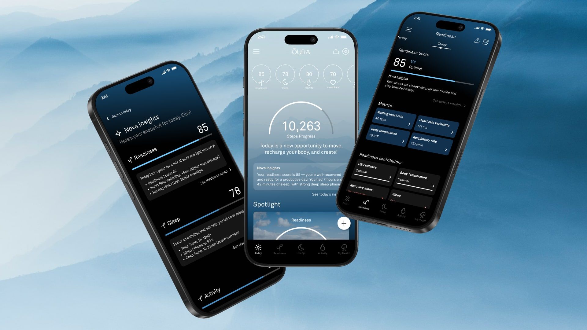
Oura is a smart ring and wellness app that helps people understand their sleep, readiness and activity through detailed biometric tracking.
This project is a redesign of the 2025 version of the Oura app. The ring already collects detailed data every night and day; my goal was to help people understand what their scores mean, and know what to do next.
Key features
Sleep
Tracks sleep quality, including stages, time in bed and efficiency.
Readiness
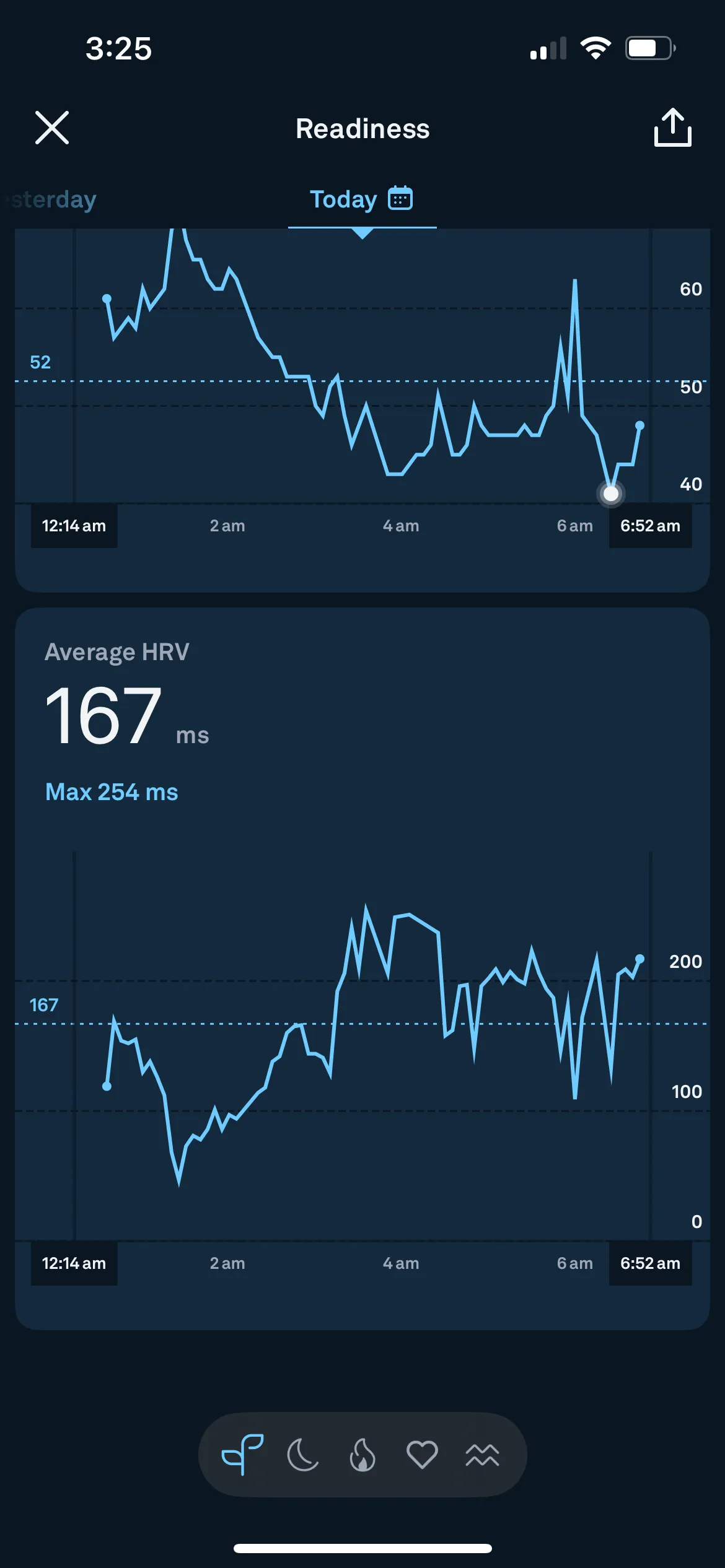
Combines resting heart rate, HRV and body temperature into one readiness score.
Activity
Monitors steps, calories burned and recovery.
Research
Current App Interviews
Everyone I interviewed liked the app, but struggled to act on its data.
Ellie
- College student
- Loves to work out
- Uses an Apple Watch
Thoughts
- Likes how clean and simple it is, but it takes a lot of time to understand.
Confusing points
- In the Readiness, Sleep and Activity tabs, the calendar only appears next to “Today.” It would be easier to find as an icon in the same spot, top right, on every tab.
- What could make the app more helpful to you as someone who works out?
- If it could just say, “Hey, you slept less than usual, maybe go to bed earlier tonight.” Like, just talk to me in normal language. It’s too data-heavy sometimes.
- How would you feel about AI helping you interpret data?
- That would actually be cool. Like a little coach that checks in and gives encouragement or suggestions based on how I’m doing. This is something that I feel like would be super good because I don’t know what certain things mean.
Stacy
- Busy hairstylist
- Uses Oura
- Mom, 50
Thoughts
- Likes the overall app, but there is so much data that she doesn’t know how to understand it.
Confusing points
- Doesn’t know what all of the data means, but likes the visual breakdowns in red, peach and bright blue.
- The information button on a category doesn’t tell her everything she needs to know.
- What do you like most about the Oura app?
- I love how detailed the sleep tracking is. I check my readiness and sleep score every morning. It feels accurate.
- What do you find challenging or frustrating?
- Honestly, there’s a lot of data, so sometimes it’s hard to know what matters. I see a lower readiness score, but I’m not always sure why it’s low or what to do about it.
- How would you improve the experience?
- I’d love a feature that just tells me what the numbers mean and gives me one thing to focus on. Maybe something more personalized.
Sydney
- College student
- Uses Oura
Thoughts
- Uses the app to fine-tune her wellness routine.
- Tracks HRV, sleep stages and recovery to guide her workouts.
Confusing points
- Too much raw data: “Sometimes I miss important trends because I don’t have time to interpret everything.”
- No clear next steps: “The app shows me patterns, but doesn’t always tell me what to do.”
- What keeps you coming back to the Oura app?
- I’m obsessed with optimization. I use it for HRV, sleep stages, even adjusting workouts. I use it to plan rest days too.
- Are there any limitations or gaps?
- I wish there was a smarter insights layer. Like, sometimes I miss things because I don’t have time to dig into the charts.
- What kind of features would help you most?
- AI that explains trends and gives next steps would be great. Like: “Your deep sleep has been down 3 nights, maybe avoid caffeine past noon.” That’s gold.
Heuristic evaluation
Ten Heuristics, One App
I reviewed the current Oura app against Nielsen’s ten usability heuristics.
Heuristics
Visibility of status
Do you know where you are in the system and where you can go next?
e.g. Elevator buttons lighting up
In the Oura app
- The bottom navigation bar and Home overview show where you are and how you’re doing today.
- Each section, like Sleep, has a consistent header and back button.
System vs. real world
How similar are the digital and physical experiences?
e.g. Shopping carts on a website vs. in a store
In the Oura app
- The ring is effortless: it just sits on your finger and needs no interaction.
- The app is the opposite: you dig through charts, scores and insights to get value.
User control and freedom
Does the user get lost in the experience at any time?
e.g. Back buttons; the ability to edit a shopping cart
In the Oura app
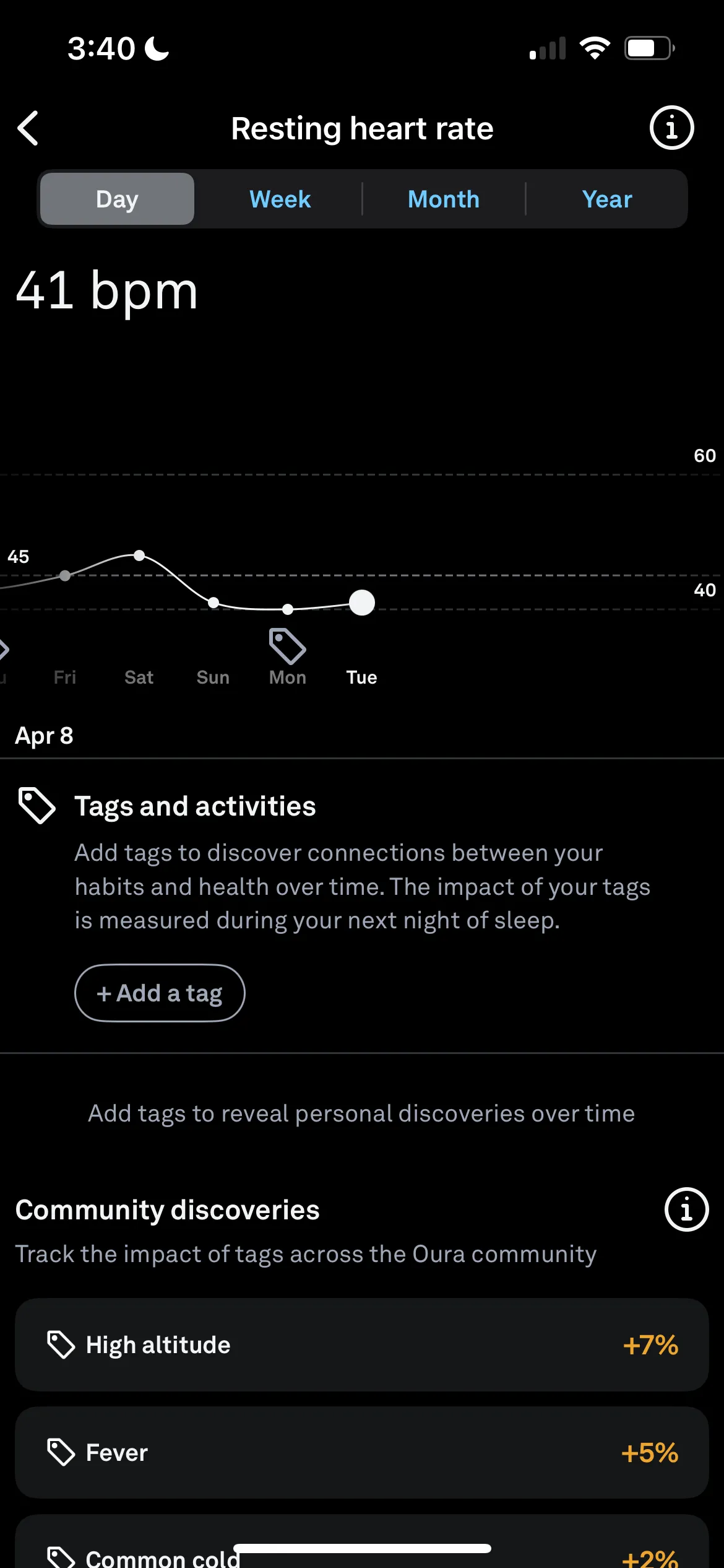
- Deeper views, like past trends or tags, aren’t easy to find or return from.
- Dozens of metrics with no priority leave newer users unsure what matters today.
Consistency and standards
Does the system follow patterns?
e.g. Buttons in the same place; no new functionality introduced mid-experience
In the Oura app
- The fixed bottom navigation bar means users can always get back to the main areas.
- Data cards repeat across screens, so users learn the layout once and use it everywhere.
Error prevention
How is the system designed to avoid mistakes?
e.g. Similar features grouped together
In the Oura app
- The app is mostly read-only, so there’s little room for mistakes.
- Tags like “stressed” or “travel” come with no guidance, so users may tag inconsistently.
Recognition rather than recall
Is there enough information on the surface to know where you’ll go next?
e.g. Breadcrumbs, onboarding, pagination
In the Oura app
- There are no breadcrumbs or “you are here” cues, so users can lose their place.
- There’s no way to jump between related views, like Sleep to Readiness, without backing out.
Flexibility and ease of use
Does the experience differ between novice and expert users?
e.g. Keyboard shortcuts; shortcuts for efficiency
In the Oura app
- Novices get lost in terms like HRV and latency, and don’t know which score matters.
- Experts move between days, weeks and months, and know how each metric applies to them.
Aesthetics
Can you strip the screen down to its main components?
e.g. White space, simplicity
In the Oura app
- Simple type and clean card layouts keep each screen focused on its main data.
- Navy on dark navy is too subtle, so older users struggle to tell sections apart.
Help users find errors
Are mistakes easy to identify?
e.g. Toast notifications, red Xs vs. green checkmarks
In the Oura app
- Green checkmarks and blue buttons confirm positive actions, like “Sync complete.”
- Red marks low scores, like poor sleep, rather than actual errors.
Help and documentation
Can users learn how to navigate the experience if needed?
e.g. FAQs, a help assistant, contact info
In the Oura app
- Users can learn the app, but some features are tucked away and easy to miss.
- There’s no FAQ or help assistant, which is why an AI guide would help.
Current app analysis
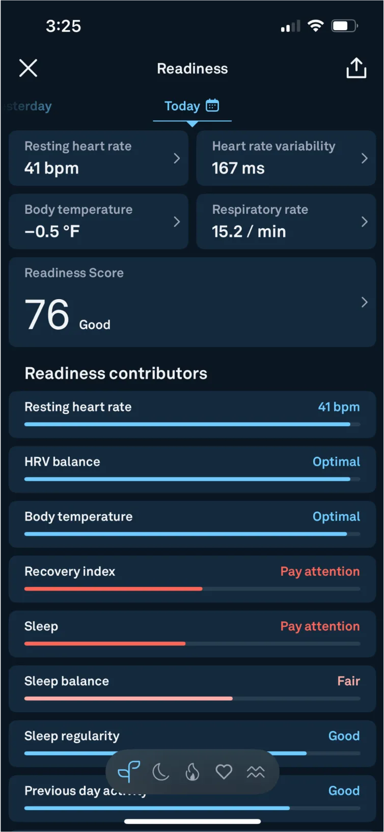
Inside the Readiness Screen
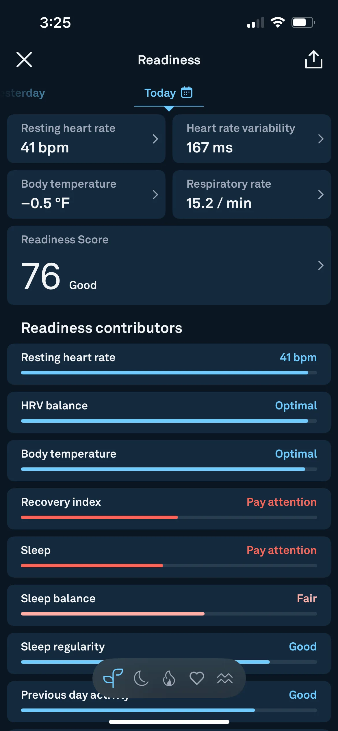
The score is buried
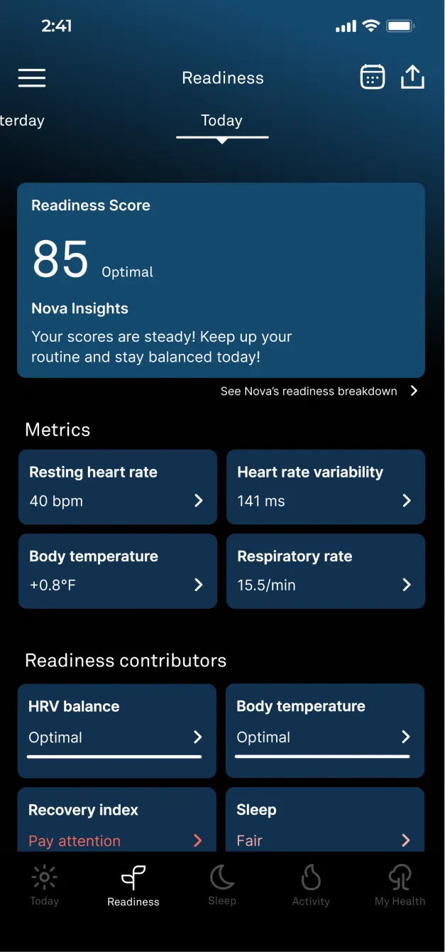
The readiness score is the first thing people look for, but it sits four boxes down and blends in. Should it be emphasized, and come first?
Low-contrast contributors
The navy and dark navy are too close for older users to tell sections apart. Better contrast would improve readability and the overall experience.
A calendar only on “Today”
The calendar sits next to “Today,” and it’s the only place in the app you can reach it. It would make more sense in the top right, next to the export button.
Tiny, crowded tabs
The bottom tabs are small and close together, so it’s hard to pick a page. They need to be bigger and spread out. When I interviewed users, 4 of 5 preferred reaching these from the nav bar instead of going through Vitals.
Refinement
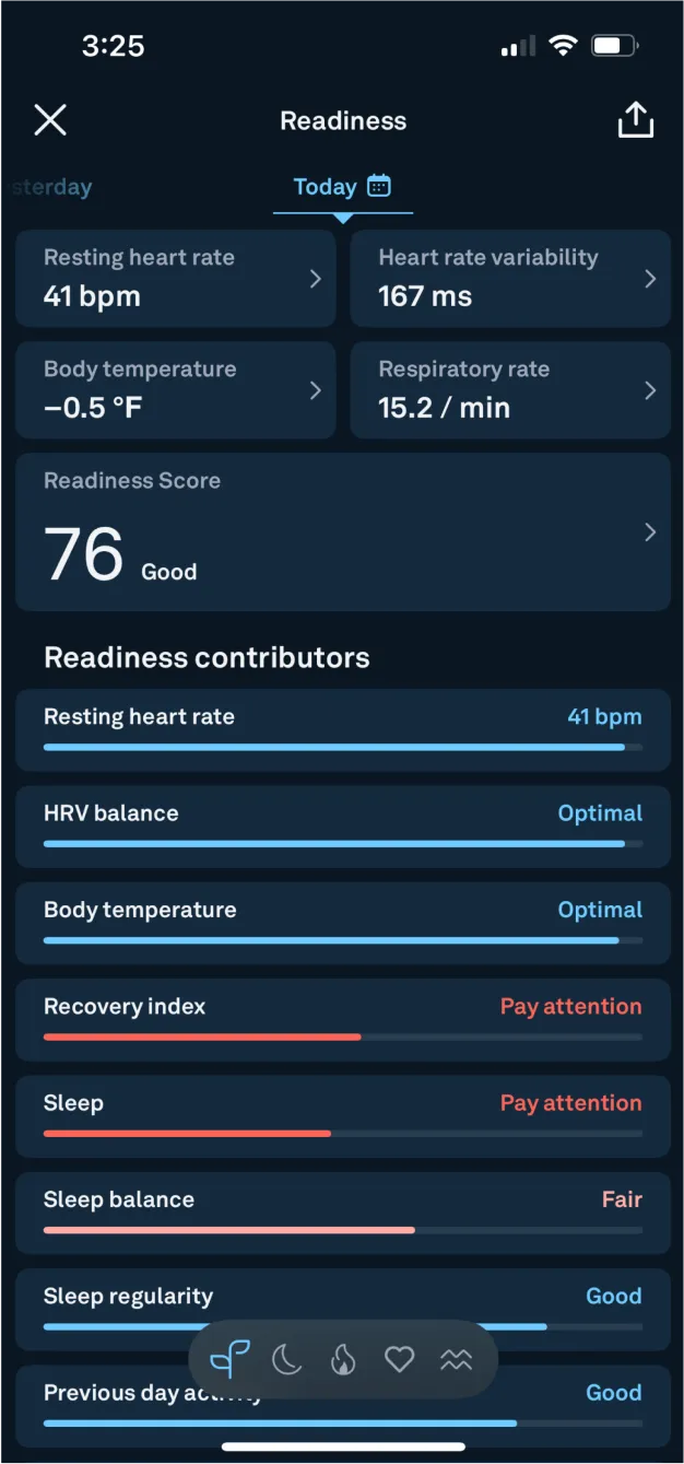
Readiness, Sleep & Activity Refinement
The calendar moves to the top right, an easier spot that stays the same from screen to screen.
Your score is what people look for first, so the score card sits at the top of each section, in a lighter blue that stands out.
Tap anywhere on the card, or on the text and arrow, to see Nova’s readiness breakdown.
The metrics section, unlabeled before, now has a label.
Contributors are in two columns, so they’re organized more efficiently.
Stronger contrast: light navy on dark navy becomes a lighter blue on black, so sections are easy to tell apart.
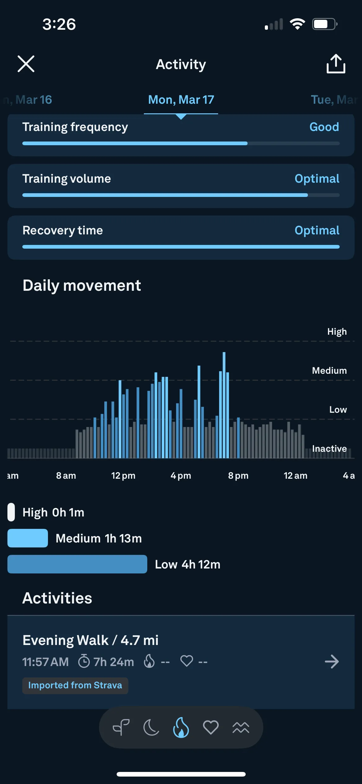
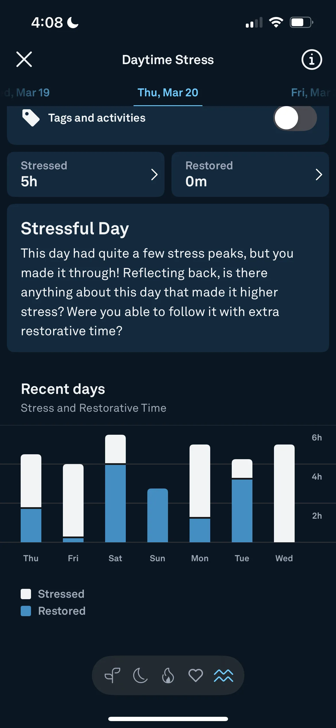
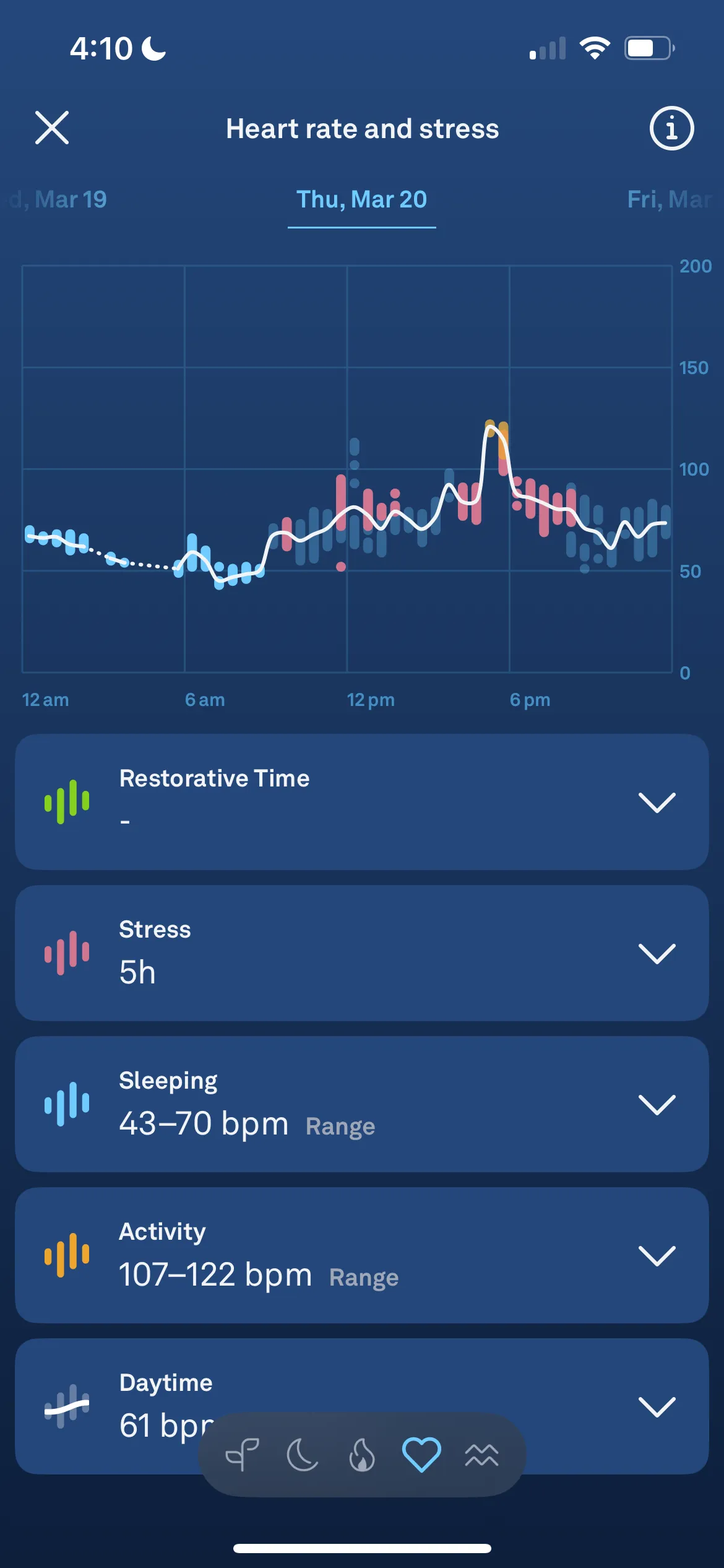
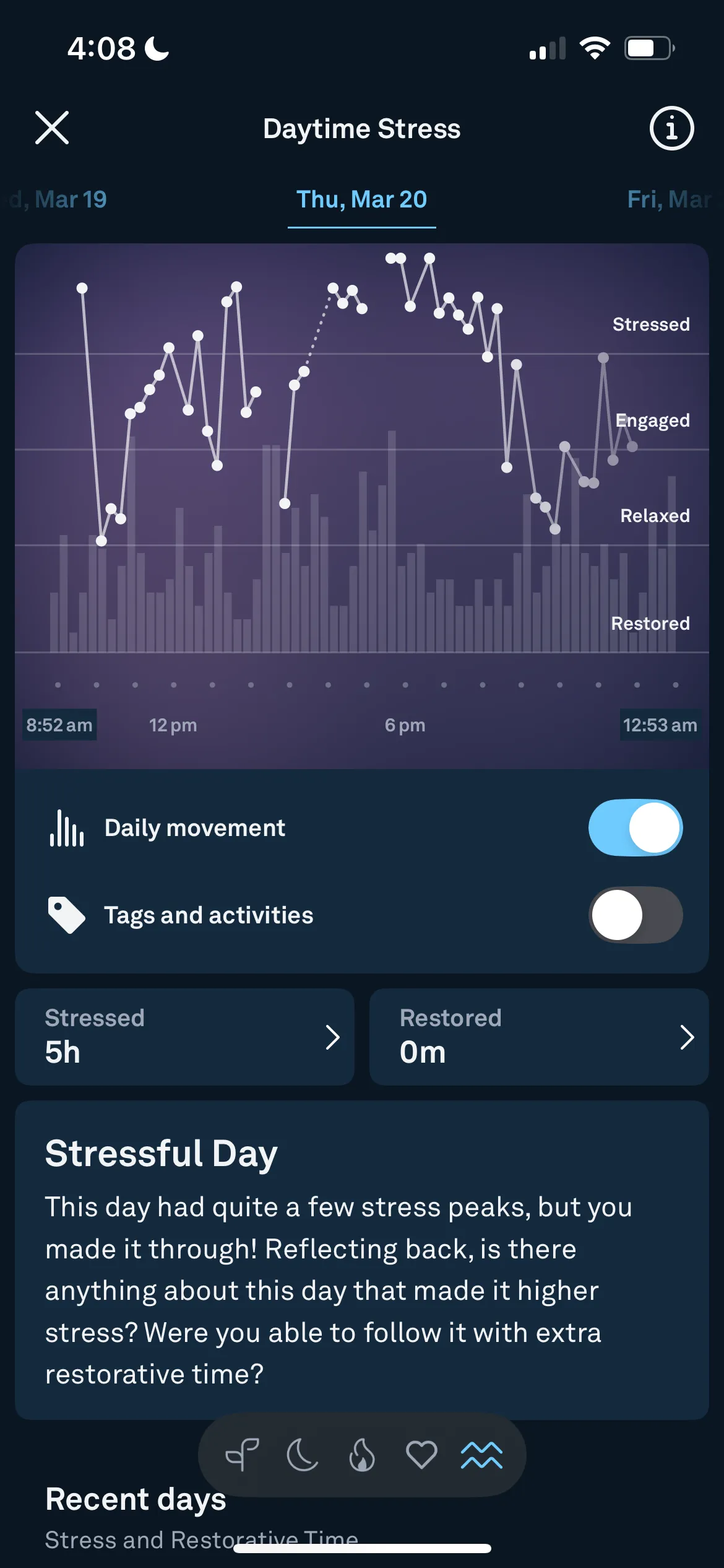
Problem
Data Without Direction
- Oura has a lot of information.
- It gives you all of the statistics, but doesn’t tell you what to do about them.
- Many users feel overwhelmed and don’t know where to start.

Solution
App Redesign Solution
Nova, your AI guide, helps people in three ways.
AI Chat
- Ask Nova questions in the app instead of doing your own research.
- Ask about your stats, trends, or anything else.
Daily insights
- A brief overview on the home screen, without being overwhelming.
Score breakdown
- A deeper look at your readiness, sleep and activity, what to pay attention to, and a personalized plan for today.
User flow
Where Nova Fits In
Nova can be used in three parts of the app, each one step from where people already are.
Nova Chat
From Today, ask Nova about your stats, trends or anything else, instead of doing your own research.
Nova Insights
A brief daily overview of readiness, sleep and activity on the home screen, without being overwhelming.
Nova breakdown
Inside Readiness, Sleep and Activity: what to pay attention to, and a personalized plan for today.
Log in / open app
Today
1Nova Chat
2Nova Insights
- Readiness
- Sleep
- Activity
Readiness · Sleep · Activity
Readiness
3Readiness Nova breakdown
Readiness stats
Sleep
3Sleep Nova breakdown
Sleep stats
Activity
3Activity Nova breakdown
Activity stats
Persona
Designing for Ellie

Ellie Smith
20, college student
Loves to work out and stay fit; wants to improve her energy, balance academics and sleep better
Likes
- Quick, visual feedback on how she’s doing
- Personalized health advice
- Seeing trends in her sleep and recovery
- Feeling in control of her energy and wellness
Wants
- Clear explanations of what her scores actually mean
- Specific tips she can act on without digging
- An AI that talks to her in normal, encouraging language
- Tools to plan workouts and rest around her school schedule
- Not just the stats, but what she can do about them and how to improve.
Personality
- Introvert to Extrovert: leans Extrovert
- Analytical to Creative: leans Analytical
- Busy to Time rich: leans Busy
- Messy to Organized: leans Organized
- Independent to Team player: leans Independent
- Passive to Active: leans Active
- Safe to Risky: leans Safe
Usability testing
Version 1: Four Tasks
Testers completed four tasks in the first version, then rated each one from 1 to 10.
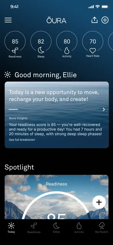
Task 1Today
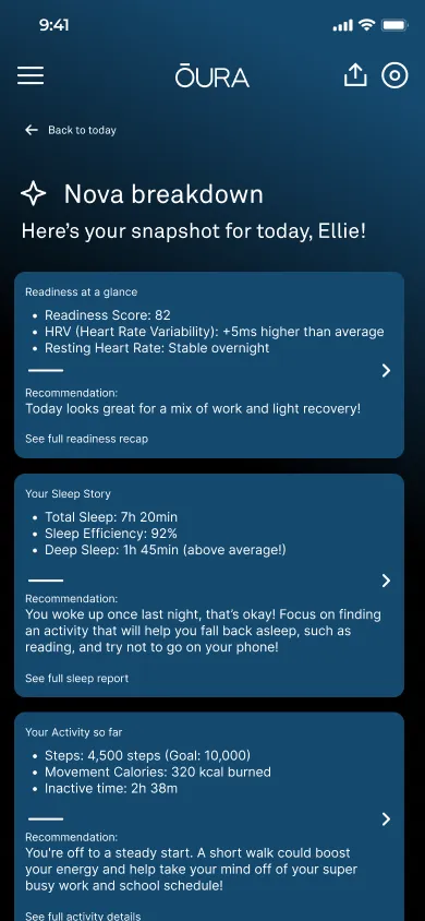
Task 2Nova Insights
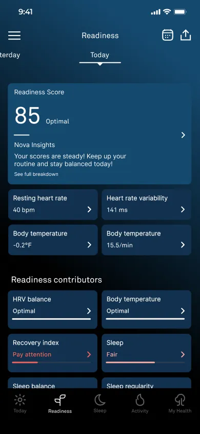
Task 3Readiness
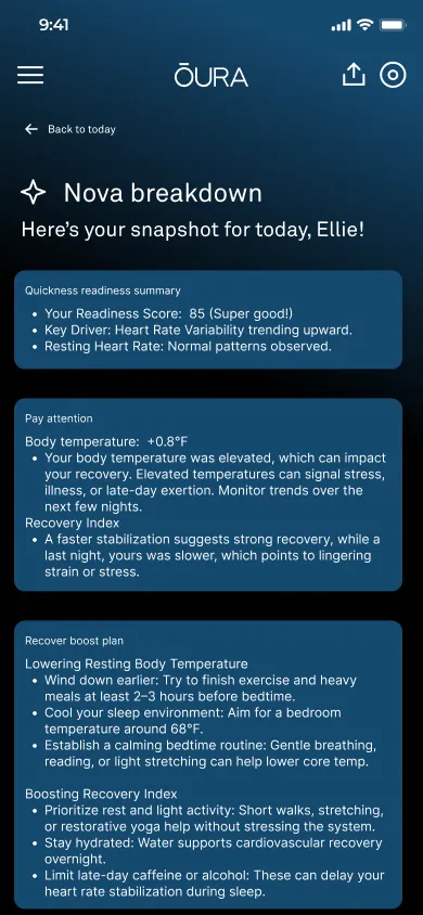
Task 3Readiness Nova breakdown
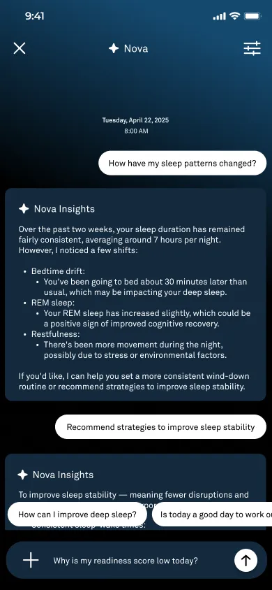
Task 4Nova Chat
Task 1
Navigate to the Home screen and find your Readiness, Sleep and Activity scores.
Completed
- How easy was it to find your key scores on the Home screen?
- How clearly were the scores presented to you?
Task 2
Tap the Nova card to view your personalized AI insights for Readiness, Sleep and Activity.
Completed
- How easy was it to find and open the Nova card?
- How helpful did the overview insights feel?
Task 3
Go to Readiness and find Nova’s breakdown, specifically for Readiness.
Completed
- How easy was it to act on Nova’s suggestion?
- How likely are you to use this feature regularly?
Task 4
Use the AI chat to ask Nova: “How can I improve my sleep?”
Completed
- How natural did the chat interaction feel?
- How relevant were Nova’s sleep suggestions?
Findings
What Testers Said
How easy was it to find your key scores on the Home screen?
1 = Very difficult, 10 = Very easy
9.8out of 10 Users found their key scores very easily. The Home screen is intuitive here and matches what people expect.
Responses: 9, 10, 10, 10, 10
How natural did the chat interaction feel?
1 = Very awkward, 10 = Very smooth
9.6out of 10 Users found the AI chat intuitive and conversational, so Nova’s tone and interaction style fit their expectations.
Responses: 10, 9, 9, 10, 10
Key finding
The breakdown made sense, but didn’t tell people what to do next.
After using Nova Insights and the breakdown, how helpful did the overview feel?
1 = Not helpful at all, 10 = Extremely helpful
Each tester’s rating
Responses: 9, 6, 7.5, 6, 7
They liked the AI insights and breakdown, and they made sense, but the design could be improved to make the breakdown feel more helpful. Users wanted it more intuitive, and to know what to do based on the insights.
How it compares (average out of 10)
Iteration
Refinement Process
The key finding pointed at the Nova breakdown, so I reworked that screen through two more versions to make it clearer and easier to act on.
Before
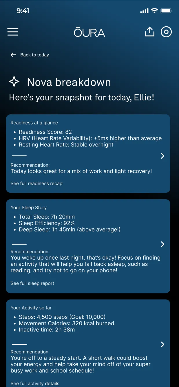
Each card mixed the stats and the recommendation under a small heading.
Version 1
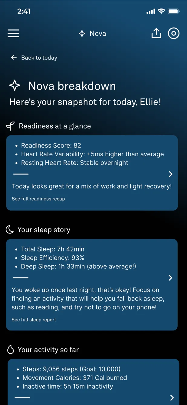
Section titles with icons move above the cards, so each part is easy to find.
Version 2
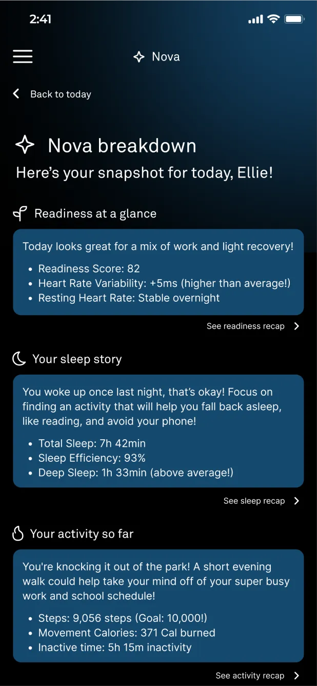
The recommendation leads each card, so people see what to do first.
Final
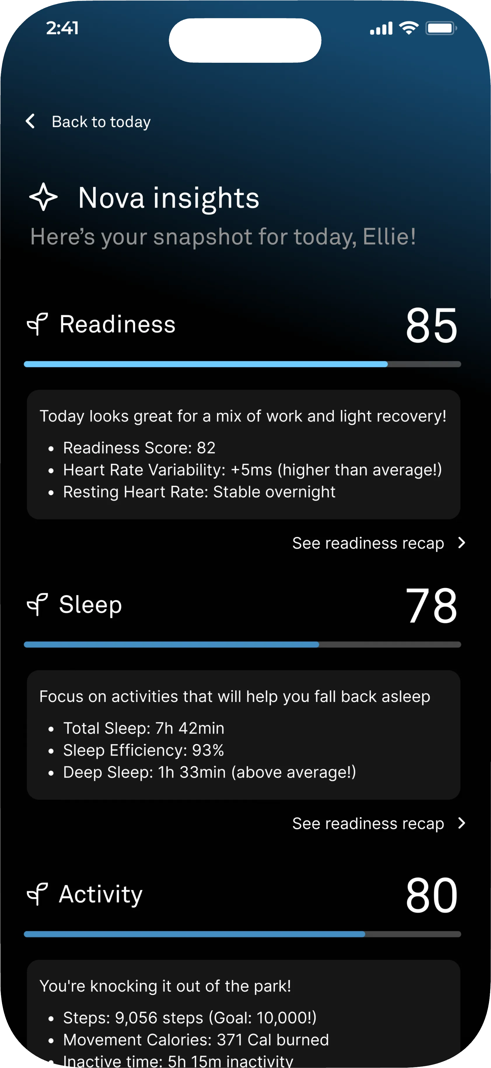
Each section shows its score and a progress bar up top, now called Nova insights.
Usability testing
Version 2: Retested
I tested the refined version with four tasks again, then asked testers to rate each part.
How helpful did the overview feel?
+29 points after the refinement
5/5
testers completed all four tasks
Task 1
Navigate to the Home screen and find your Readiness, Sleep and Activity scores.
100% How easy was it to find your key scores on the Home screen?
Task 2
Tap the Nova card to view your personalized AI insights for Readiness, Sleep and Activity.
100% How helpful did the updated overview feel to you?
Task 3
Navigate to Readiness and find Nova’s breakdown.
100% How likely are you to use the breakdown feature?
Task 4
Use the AI chat to ask Nova: “How have my sleep patterns changed?”
100% How natural did the chat interaction feel?
Final prototype
Try the Redesign
This is the final version, after both rounds of testing. Click through it the way testers did.
Things to try
- Tap the Nova Insights card on Today for your daily overview.
- Open Readiness and find Nova’s breakdown.
- Ask Nova a question in the chat.
Conclusion
From Data to Direction
01
Simple beats more data
People get overwhelmed when a lot of numbers are thrown at them. The first round of testing showed they wanted a simple, plain design.
02
Testing proved the direction
After the refinement, the second round rated the updated overview 100%, up from 71%, so the simpler design was on the right track.
03
A guide makes data approachable
A conversational AI guide like Nova eases people into understanding their data and breaks it down in an easy way.